Fruit Oasis Branding & Packaging
Project Overview
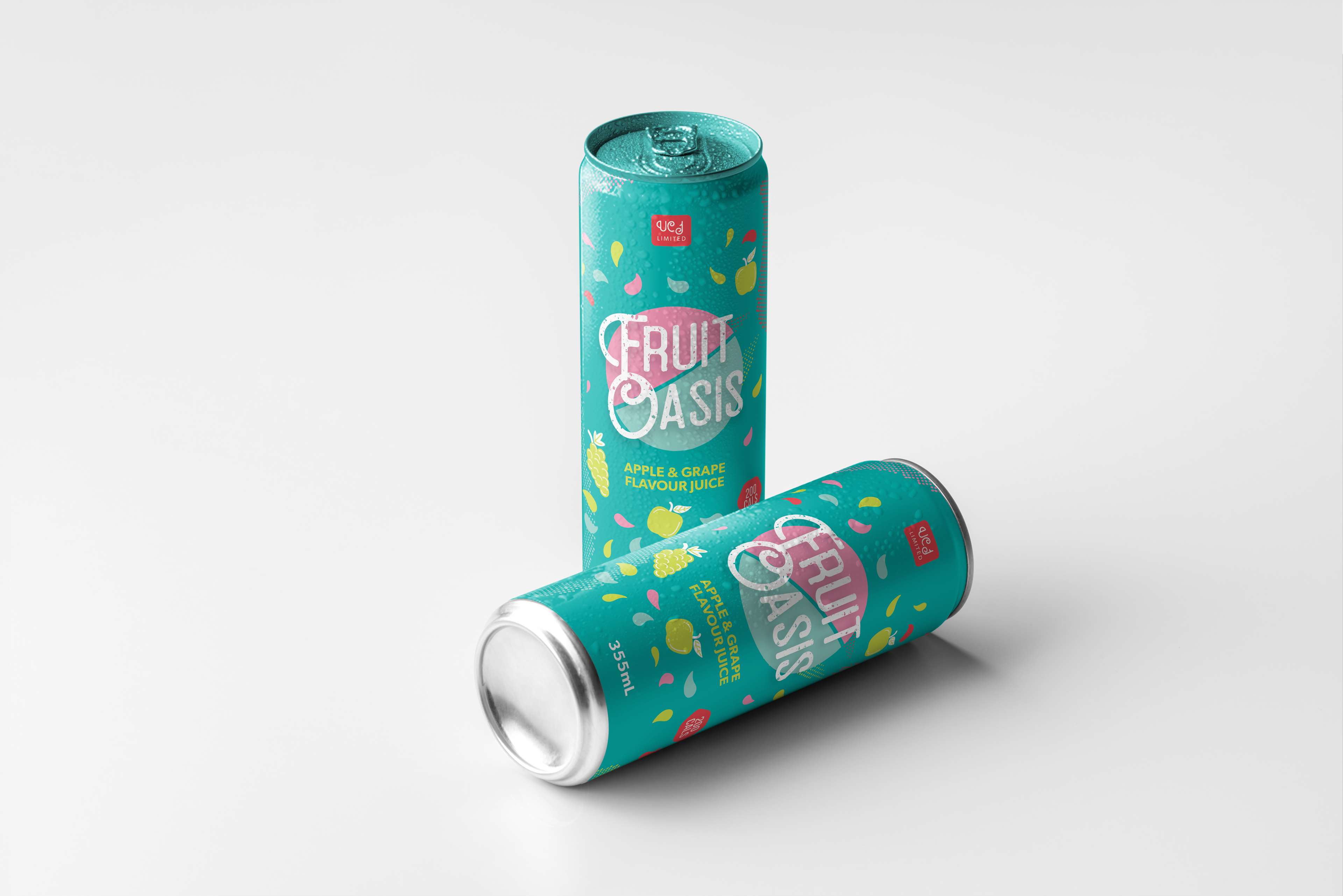
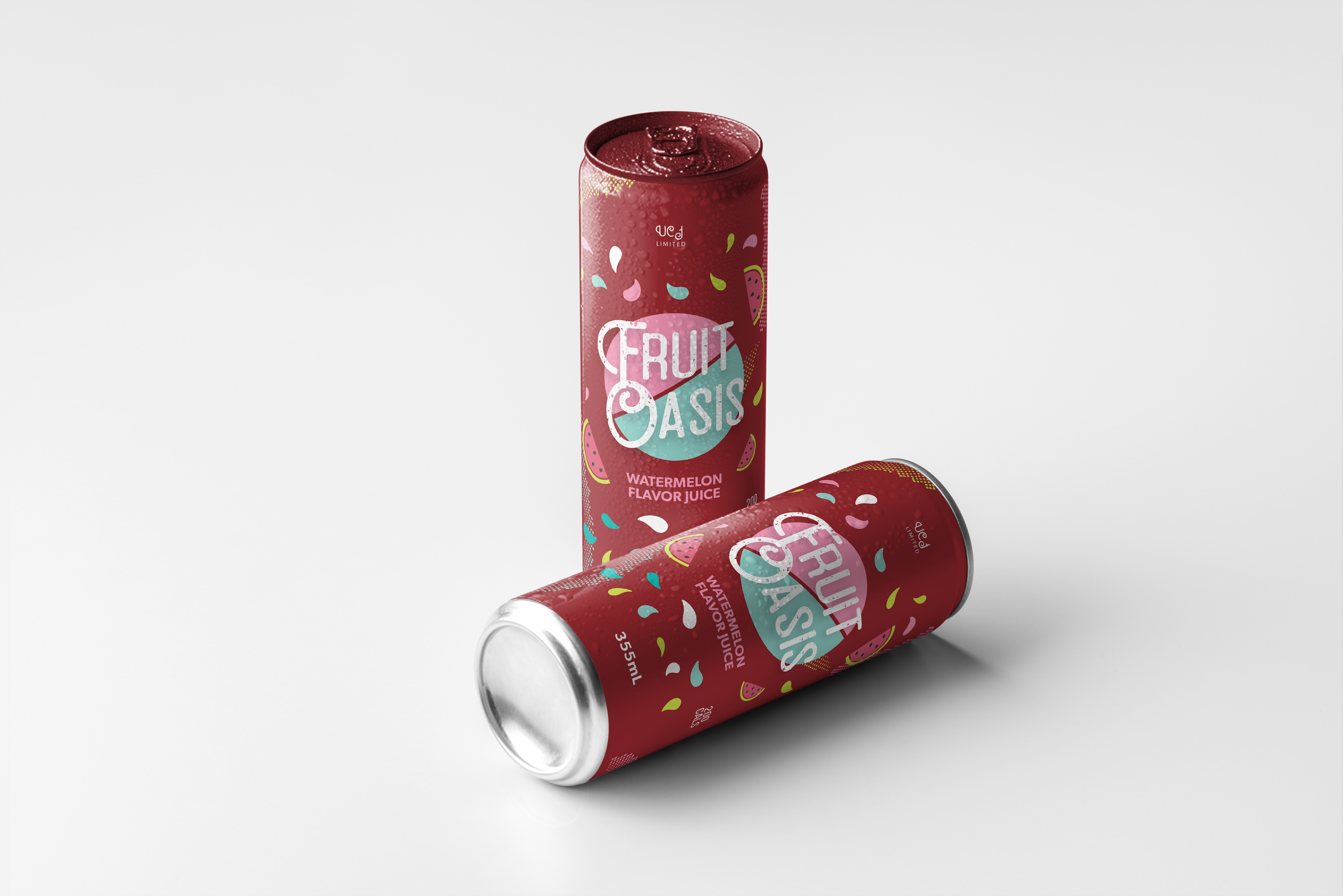
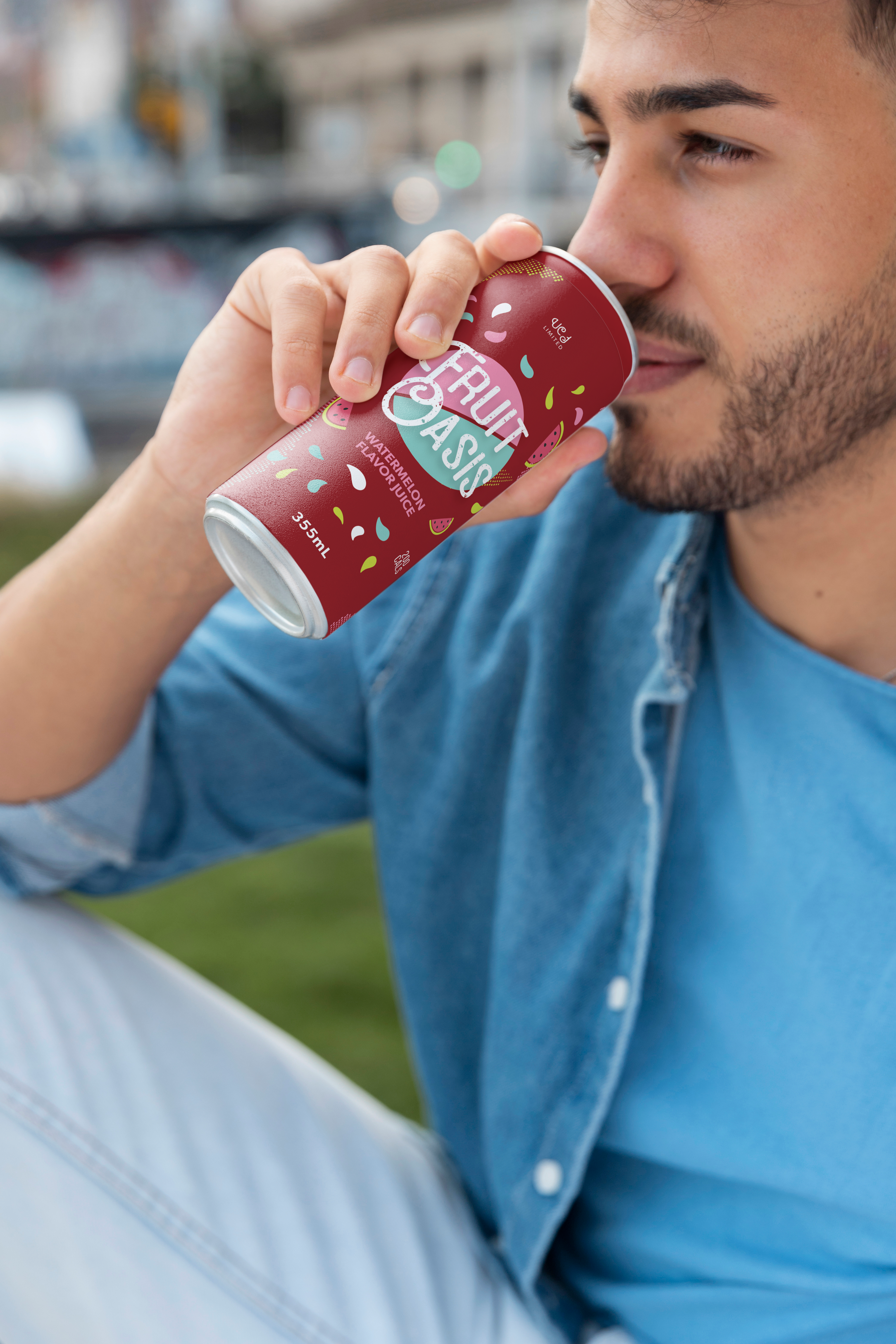
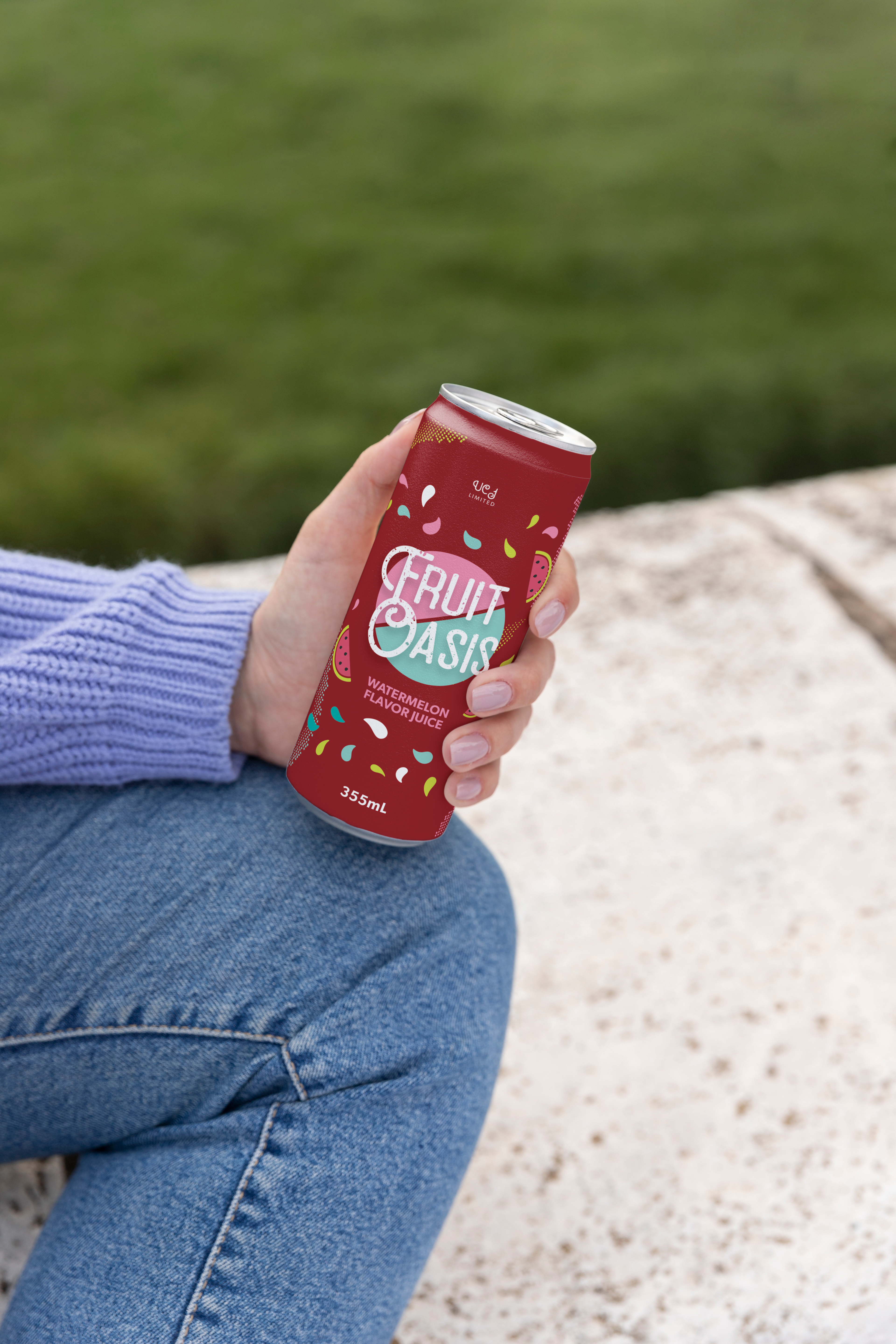
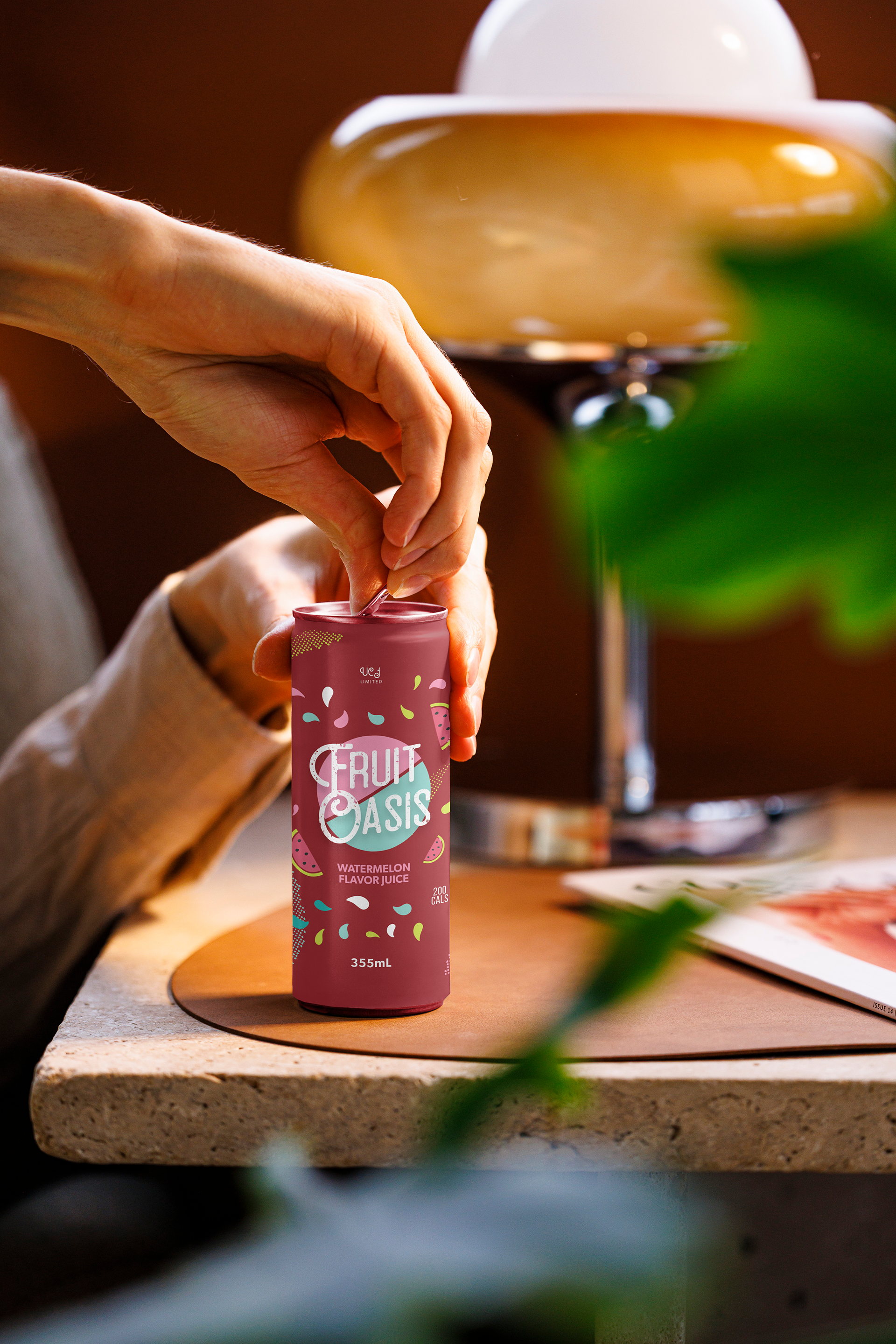
Fruit Oasis is a beverage brand offering refreshing, fruit-based drinks with a focus on natural ingredients and vibrant flavors. This branding and packaging project was developed for the grape and apple flavors, ensuring a fresh and inviting look that appeals to health-conscious consumers. The goal was to create a modern, eye-catching design that conveys freshness, quality, and excitement while maintaining a strong shelf presence.
Concept & Inspiration
The design is inspired by lush fruit orchards and tropical freshness, emphasizing the natural goodness of the beverages. The combination of teal, pink, and green was chosen to reflect the cool, refreshing nature of the drink while differentiating the two flavors.
Teal symbolizes freshness and a modern brand feel.
Pink adds vibrancy, energy, and playfulness.
Green reinforces the natural and organic fruit elements.
Typography and graphical elements were carefully selected to complement the brand’s identity, ensuring an approachable and engaging aesthetic.
Design Process & Sketches
The design process began with market research and competitor analysis, identifying what makes a beverage stand out on store shelves. Initial sketches explored various fruit-inspired iconography, abstract patterns, and minimalistic layouts to create a dynamic and appealing package.
Key considerations included:
Key considerations included:
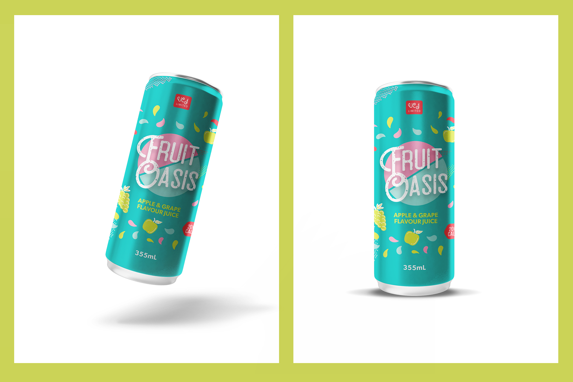
Ensuring high readability for product name and flavor.
Incorporating subtle fruit illustrations and splashes to represent the juice's natural essence.
Balancing a clean, modern aesthetic with a fun, playful touch.
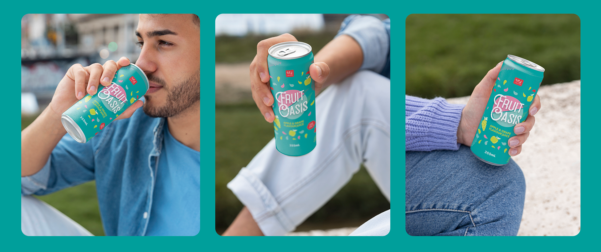
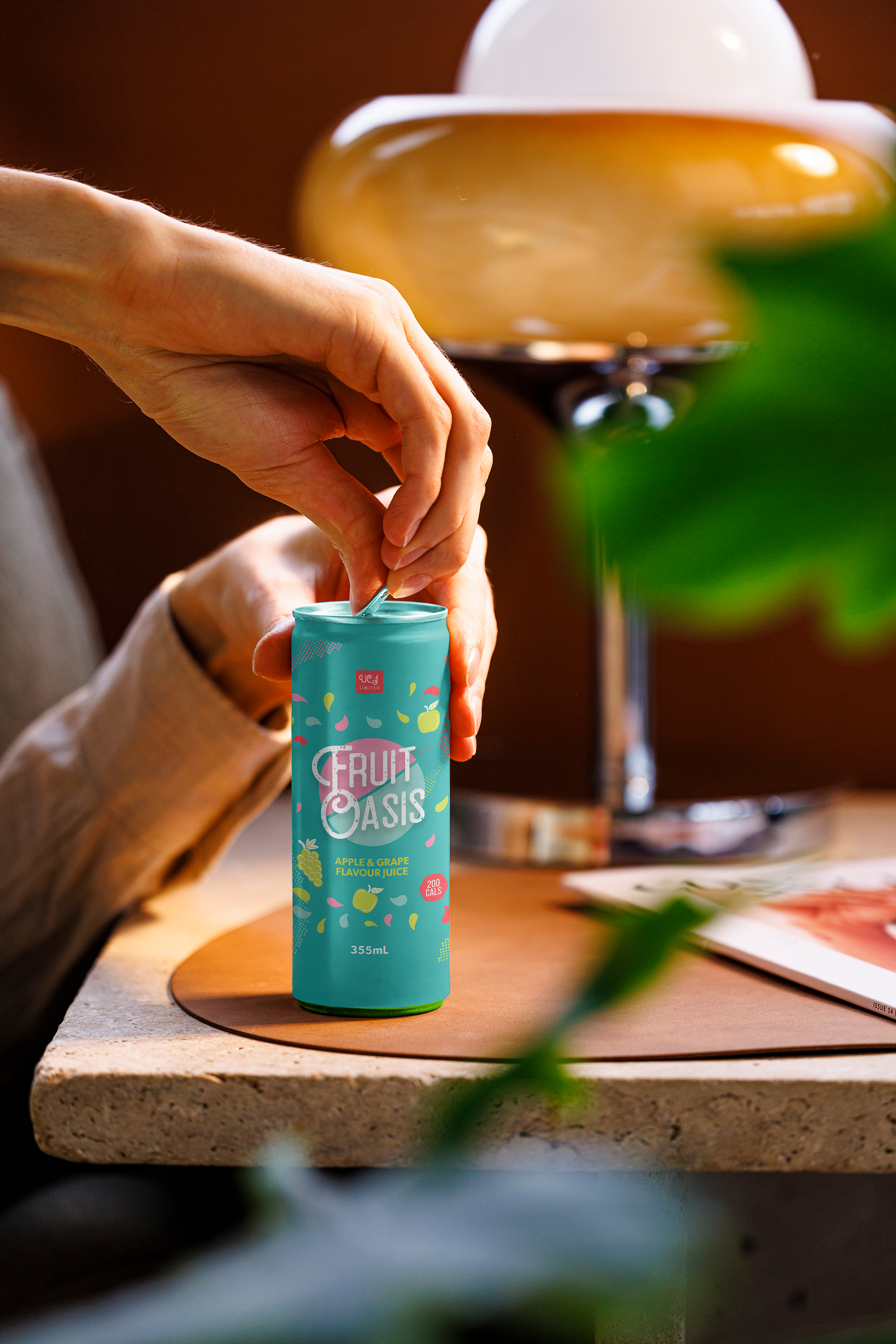
Application & Brand Consistency
The final branding and packaging were designed for multiple touchpoints, ensuring consistency across:
Bottle/Can Packaging: Sleek, modern, and vibrant to stand out in retail environments.
Marketing Materials: Social media ads, posters, and in-store promotions maintain the brand’s visual identity.
Digital Presence: Website and social media graphics align with the packaging for a cohesive look.